
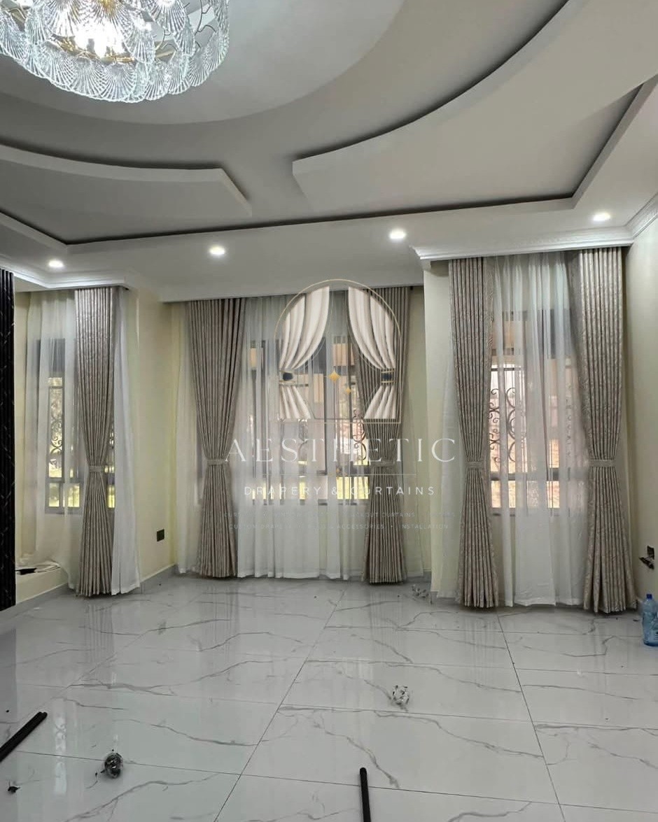
Choosing the right curtain colour can transform the appearance of a room. Curtains occupy a noticeable area of the wall, and their colour can influence how spacious, warm, bright or coordinated an interior feels.
Whether you are furnishing a new home, updating your living room or replacing old bedroom curtains, selecting a suitable shade involves more than choosing a colour you like.
The curtains should complement your wall paint, furniture, flooring, lighting and other decorative elements. They should also suit the purpose of the room and the atmosphere you want to create.
Modern interiors increasingly make use of versatile neutral shades, warm earthy colours, soft natural tones and carefully selected contrasts. However, there is no single curtain colour that works for every home.
At Aesthetics Drapery and Curtains, we help homeowners and businesses explore curtain fabrics and colours that complement different interior styles while maintaining comfort, privacy and functionality.
1. Why Curtain Colour Matters in Interior Design
Curtains are both functional window coverings and important decorative elements.
The colour you select can influence the overall balance of your interior in several ways.
Creating a Coordinated Appearance
Curtains can connect different elements within a room, including sofas, carpets, cushions, wall finishes and decorative accessories.
For example, curtains in a warm neutral shade can complement wooden furniture, beige upholstery and natural flooring.
Influencing the Perception of Space
Lighter curtain shades can help a room feel open and bright, especially when combined with suitable wall colours and natural lighting.
Darker colours can introduce contrast, depth and a more dramatic appearance.
Establishing the Mood of a Room
Different colours create different visual effects.
Soft neutrals often produce a calm and understated atmosphere, while deeper shades can make a room feel more intimate and sophisticated.
Complementing Natural Light
The amount of natural light entering a room can influence how curtain colours appear.
A fabric that looks warm under showroom lighting may appear different in a room receiving direct sunlight or limited daylight.
It is therefore important to consider the actual lighting conditions before making your final choice.
2. Popular Curtain Colour Trends for Modern Homes
When selecting curtains, consider colours that complement your existing interior rather than following trends without considering your space.
The following shades offer useful inspiration for contemporary homes.
3. Warm Beige and Cream Curtains: Timeless Neutral Choices
<text></text>
Warm beige and cream curtains remain versatile options for homeowners who prefer an elegant, understated interior.
These colours work particularly well in rooms with warm wall finishes, wooden furniture, neutral sofas and natural decorative materials.
Why Choose Beige and Cream?
- They complement many interior colour schemes.
- They create a soft and welcoming appearance.
- They work well with both traditional and contemporary furniture.
- They can coordinate with different shades of brown, white and grey.
- They offer flexibility when changing other decorative elements.
Where Do They Work Best?
Consider beige and cream curtains for:
- Living rooms.
- Master bedrooms.
- Dining rooms.
- Guest bedrooms.
- Open-plan living spaces.
For a layered window treatment, cream sheers combined with beige decorative curtains can create depth while maintaining a bright appearance.
4. Grey Curtains: A Contemporary and Versatile Option
Grey curtains are popular in modern interiors because they can complement a wide range of furniture and wall colours.
Depending on the shade, grey can create either a soft, subtle finish or a stronger contrast.
Light Grey Curtains
Light grey curtains work well in bright rooms with white walls, silver accessories and contemporary furniture.
They can introduce colour without making the window treatment feel visually heavy.
Charcoal Grey Curtains
Charcoal curtains provide a deeper, more dramatic appearance.
They can complement white walls, light-coloured sofas and interiors with darker decorative accents.
Where Do Grey Curtains Work Best?
Grey curtains can suit:
- Modern living rooms.
- Minimalist bedrooms.
- Offices.
- Apartments with neutral interiors.
- Contemporary commercial spaces.
When choosing grey, consider the undertones. Some shades appear warmer, while others have cooler blue or silver undertones.
Matching these undertones with the rest of the room helps create a more coordinated result.
5. Earthy Curtain Colours: Bringing Warmth into Your Home
Earth-inspired colours are useful for creating comfortable and welcoming interiors.
These shades include terracotta, warm brown, muted olive, sand and other natural tones.
Terracotta Curtains
Terracotta introduces warmth and character.
It can work well with cream walls, wooden furniture, neutral upholstery and natural decorative accessories.
Olive Green Curtains
Olive green provides a subtle connection to nature.
It can complement beige, cream, brown and selected grey interior finishes.
Warm Brown Curtains
Brown curtains create a grounded and cosy appearance.
They can coordinate particularly well with wooden furniture, warm flooring and neutral wall colours.
Where Do Earthy Colours Work Best?
Consider earthy curtains for:
- Living rooms.
- Bedrooms.
- Reading areas.
- Dining rooms.
- Homes with natural wood finishes.
These colours can help create a relaxed interior without relying on overly bright decorative elements.
6. White and Off-White Curtains: Bright and Minimalist Interiors

White and off-white curtains are suitable for homeowners who prefer a clean, bright and simple appearance.
They can complement a wide range of wall colours and furniture styles.
Advantages of White and Off-White Curtains
- They create a light visual appearance.
- They work well with minimalist interiors.
- They complement natural and artificial lighting.
- They can be layered with darker decorative curtains.
- They coordinate with many furniture colours.
However, pure white and off-white are not identical.
Pure white creates a crisp appearance, while off-white introduces a slightly warmer tone.
The choice should depend on the existing colours within the room.
7. Navy Blue and Deep Blue Curtains: Adding Richness and Contrast
Deep blue curtains can introduce colour without creating an excessively bright or busy interior.
Navy blue is particularly useful in rooms with neutral walls and understated furniture.
Why Choose Navy Blue?
- It creates a distinctive focal point.
- It complements white, cream and grey.
- It can create a sophisticated appearance.
- It works with selected brass, gold and wooden accents.
Suitable Rooms
Navy curtains can be considered for:
- Living rooms.
- Master bedrooms.
- Formal dining rooms.
- Executive offices.
- Hospitality interiors.
For smaller rooms, consider balancing darker curtains with lighter wall finishes and sufficient natural lighting.
8. Dusty Pink and Muted Rose Curtains: Soft Decorative Colour
For homeowners who want something different from conventional neutrals, dusty pink and muted rose offer softer alternatives.
These shades can introduce colour without overwhelming the interior.
They work particularly well with:
- Cream and beige walls.
- Light grey furniture.
- White decorative finishes.
- Wooden furniture.
- Soft neutral bedding.
Dusty pink can be used in bedrooms, guest rooms and selected living spaces where a gentle decorative appearance is preferred.
Choose muted shades when you want the curtains to complement the room rather than dominate it.
9. How to Match Curtain Colours with Wall Paint
One of the easiest ways to select curtain colours is to start with the wall paint.
Your curtains can either blend with the wall colour or introduce a controlled contrast.
White Walls
White walls provide flexibility because many curtain colours can work with them.
Consider:
- Beige for a warm appearance.
- Grey for a contemporary finish.
- Navy for stronger contrast.
- Olive for an earthy touch.
- Cream for a soft, coordinated interior.
Grey Walls
Grey walls can be paired with several curtain shades.
Suitable options include:
- White or off-white.
- Cream and beige.
- Charcoal.
- Muted green.
- Dusty pink.
Pay attention to whether the grey wall paint has warm or cool undertones.
Cream and Beige Walls
Warm wall colours can work well with:
- Chocolate brown.
- Olive green.
- Warm grey.
- Terracotta.
- Off-white.
- Deeper beige shades.
You can also create a layered neutral look by choosing curtains that are slightly darker or lighter than the wall colour.
Dark-Coloured Walls
If your walls are navy, charcoal or another deep shade, lighter curtains can help balance the room.
Consider cream, soft beige or light grey.
Alternatively, use a complementary deeper shade if you want a dramatic, coordinated interior.
10. Should Curtains Match the Sofa or the Walls?
Curtains do not have to match your sofa or wall colour exactly.
In fact, using the same colour everywhere can sometimes make the interior look flat.
A more balanced approach is to select a colour that connects different elements within the room.
For example:
- If your walls are white and your sofa is grey, consider beige or cream curtains.
- If your walls are cream and your furniture is brown, consider warm grey or olive curtains.
- If your sofa is navy and your walls are white, consider light grey or off-white curtains.
- If your room has natural wood furniture, consider earthy or warm neutral curtains.
You can also repeat small accents from your cushions, rugs or decorative accessories in the curtain fabric.
This creates visual coordination without requiring every item to have the same colour.
11. Choosing Curtain Colours for Different Rooms
Different rooms have different functions, so the most suitable curtain colour may vary throughout your property.
Living Room Curtain Colours
The living room is often one of the most visible spaces in a home.
Choose colours that complement your sofa, wall finishes, flooring and decorative accessories.
Beige, cream, grey, olive and selected deeper shades can all work depending on the interior.
For larger living rooms, layered sheers and decorative curtains can introduce texture and visual depth.
Bedroom Curtain Colours
Bedrooms often benefit from colours that create a calm and comfortable atmosphere.
Consider:
- Soft beige.
- Cream.
- Muted grey.
- Dusty pink.
- Olive green.
- Navy blue.
If light reduction is important, combine your preferred decorative colour with a suitable blackout fabric or lining.
Dining Room Curtain Colours
Dining rooms can benefit from coordinated colours that complement the furniture and lighting.
Warm neutrals, earthy tones and deeper decorative shades can all be suitable depending on the design.
Office Curtain Colours
For offices and professional environments, consider understated colours such as grey, beige, off-white and selected darker shades.
The curtains should complement the furniture while supporting the desired level of privacy and light control.
12. Should You Choose Plain or Patterned Curtains?
Curtain colour is only one part of the design. Fabric patterns also influence the appearance of the finished window treatment.
Plain Curtains
Plain curtains are versatile and easy to coordinate with different interiors.
They are particularly useful when the room already has patterned furniture, carpets or decorative accessories.
Patterned Curtains
Patterned curtains can introduce personality and visual interest.
They may feature floral designs, geometric patterns, textured effects or decorative motifs.
However, consider the scale of the pattern and the size of the room.
Large patterns can become visually dominant, especially when used across wide windows.
Textured Curtains
Textured fabrics provide visual depth without relying on strong colours or elaborate patterns.
They can work particularly well in minimalist interiors where the overall colour scheme is relatively simple.
13. The Importance of Curtain Fabric and Lighting
A curtain colour does not always look identical under different lighting conditions.
Natural daylight, warm artificial lighting and cool artificial lighting can influence how a fabric appears.
The texture and finish of the fabric also matter.
For example, a smooth fabric may reflect light differently from a heavier textured material in the same colour.
Before making a final decision:
- Consider the amount of natural light entering the room.
- Look at the fabric under different lighting conditions.
- Compare it with your wall paint and furniture.
- Consider how the colour looks during the day and evening.
- Think about whether the curtains will be decorative, functional or both.
Where possible, review fabric samples in the actual room before confirming your selection.
14. Create a Coordinated Interior with Aesthetics Drapery and Curtains
Selecting curtain colours can be easier when you consider the entire room rather than choosing fabric in isolation.
The right combination of colour, texture, heading style and hardware can help create a balanced and attractive interior.
At Aesthetics Drapery and Curtains, we help homeowners and businesses explore window treatment solutions that complement their interior spaces.
Whether you prefer neutral curtains, earthy shades, elegant darker colours or contemporary decorative fabrics, we can help you consider suitable options for your requirements.
Our window treatment solutions include:
- Custom-made curtains.
- Sheer curtains.
- Blackout curtains.
- Window blinds.
- Curtain rods, tracks and accessories.
- Motorised curtains and blinds.
- Curtain measurement and installation.
We serve customers in Nairobi and throughout Kenya, with solutions extending to East Africa.
Visit our showroom at:
New Garissa Lodge, Shop G44, Eastleigh, Nairobi, Kenya.
Call: +254 720 251 109 / +254 720 977 717
WhatsApp: +254 720 251 109
Aesthetics Drapery and Curtains – Designed for Space. Made to Inspire.
Popular versatile choices include beige, cream, grey, off-white, olive green, terracotta and navy blue. The best colour depends on your wall paint, furniture, flooring, lighting and preferred interior style.
Curtains can be either lighter or darker than walls. Lighter curtains can create a soft, open appearance, while darker curtains introduce contrast and depth. Choose according to the effect you want and the colours already present in the room.
Grey walls can work with cream, beige, white, charcoal, muted green and dusty pink curtains. Consider the undertones of the grey paint and the colour of your furniture before choosing.
Yes. Neutral colours such as beige, cream, off-white and grey remain versatile because they complement many furniture styles and decorative finishes. They also make it easier to update other parts of your interior without replacing the curtains.
No. Curtains throughout your home do not have to be identical. You can select different colours for different rooms while maintaining a coordinated overall appearance through complementary shades, similar fabric textures or consistent design details.
@aesthetic_curtains26
Instagram Profile
Aesthetic Drapery and Curtains
Facebook Page
Visit Our Showroom
Aesthetics Drapery and Curtains
New Garissa Lodge, Shop G44
Eastleigh, Nairobi, Kenya
Call: +254 720 251 109 | +254 720 977 717
WhatsApp: +254 720 251 109